Cirrus Logic: Brand authenticity, from the inside out
Site redesign, brand refresh. Strategy, creative direction, design concept. Made at Happy Cog, late 2015.
Information architecture: Amanda Buck, Aura Seltzer. Designer-in-charge: Amanda Buck. Design support and illustration: Dana Pavlichko. Front-end developer: Stephen Caver. Project manager: Andréa Pié.
Cirrus Logic is a semiconductor and audio technology company based in Austin, Texas. Quietly they supply a significant portion of the chips that go into the iPhone.
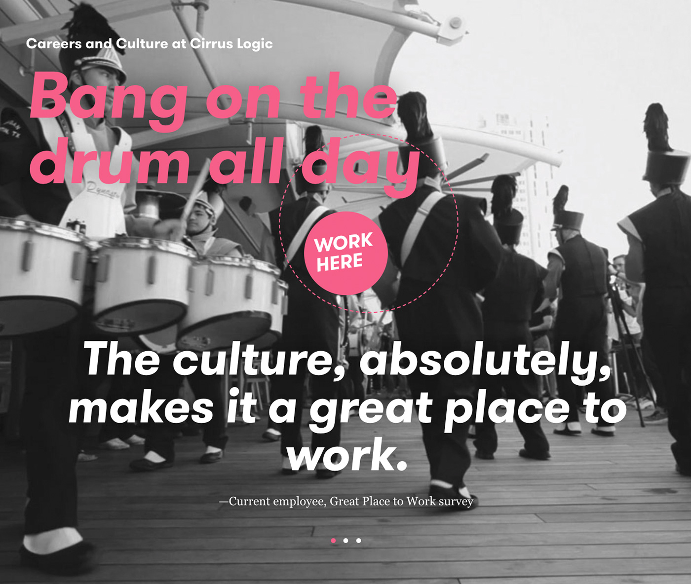
Semiconductors may evoke sterile images of clean rooms and static-free suits, but Cirrus’ staff is largely made up of passionate musicians and audiophiles, hence the motto “audio is in everything we do.” The aim of the visual identity and website redesign was to better reflect this aspect of their company culture.
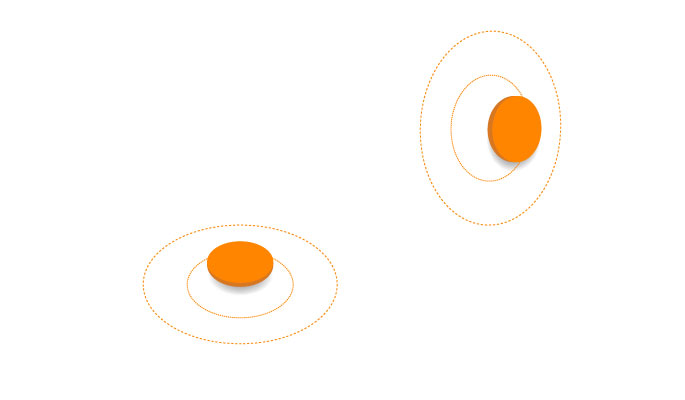
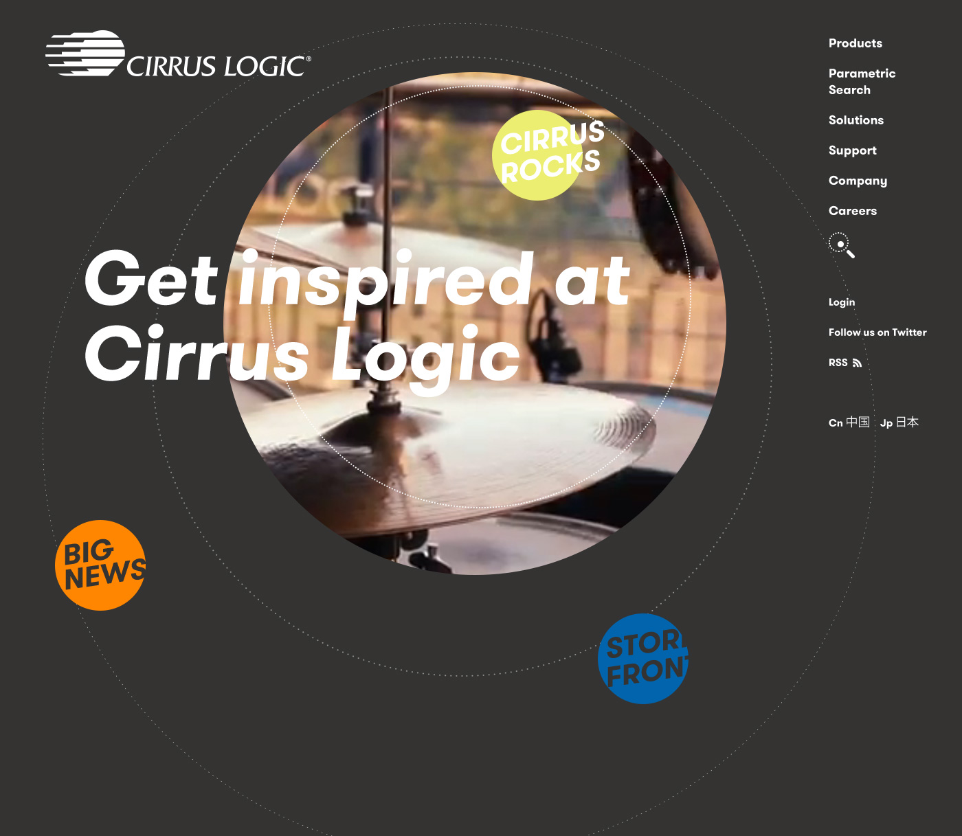
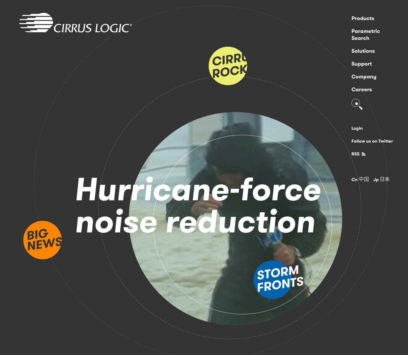
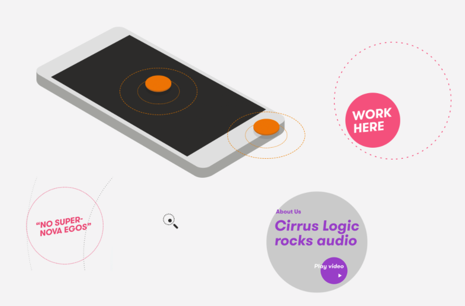
Drawing inspiration from the doppler effect, the new visual language references how sound modulates relative to an observer by placing interaction points inside a series of concentric rings.
Semiconductors may evoke sterile images of clean rooms and static-free suits, but Cirrus’ staff is largely made up of passionate musicians and audiophiles, hence the motto “audio is in everything we do.” The aim of the visual identity and website redesign was to better reflect this aspect of their company culture.
Drawing inspiration from the doppler effect, the new visual language references how sound modulates relative to an observer by placing interaction points inside a series of concentric rings.
Improving the marketing side of the website was instrumental to attracting new talent and satisfying investors.
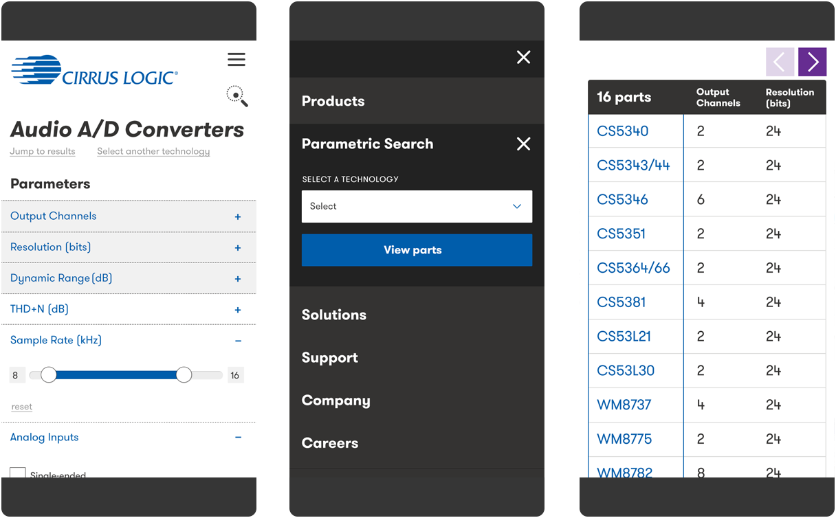
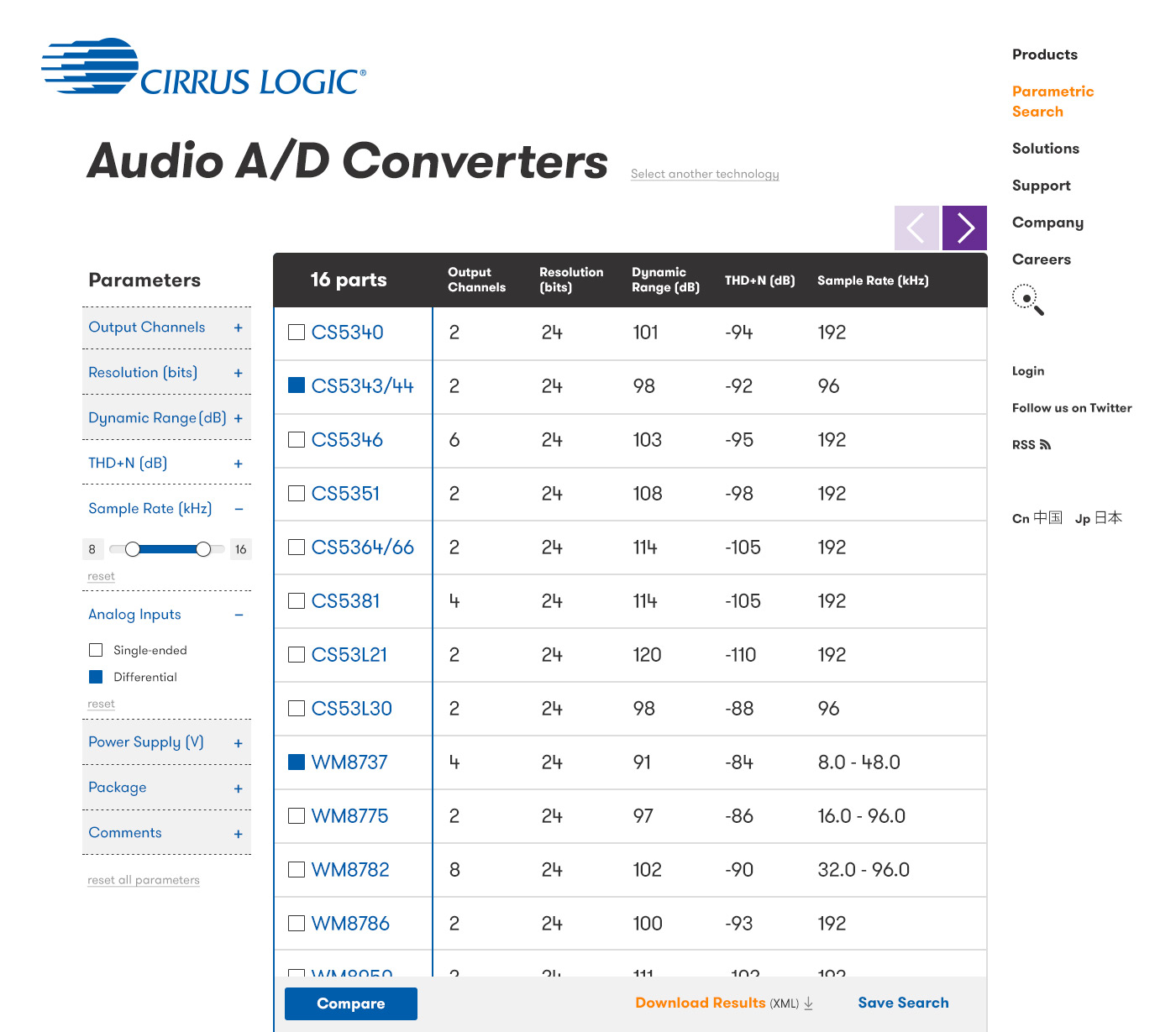
Most users of the site have historically been engineers. The redesign took great pains to make the dense technical information they need easier to filter and browse regardless of device.
![]()
Most users of the site have historically been engineers. The redesign took great pains to make the dense technical information they need easier to filter and browse regardless of device.

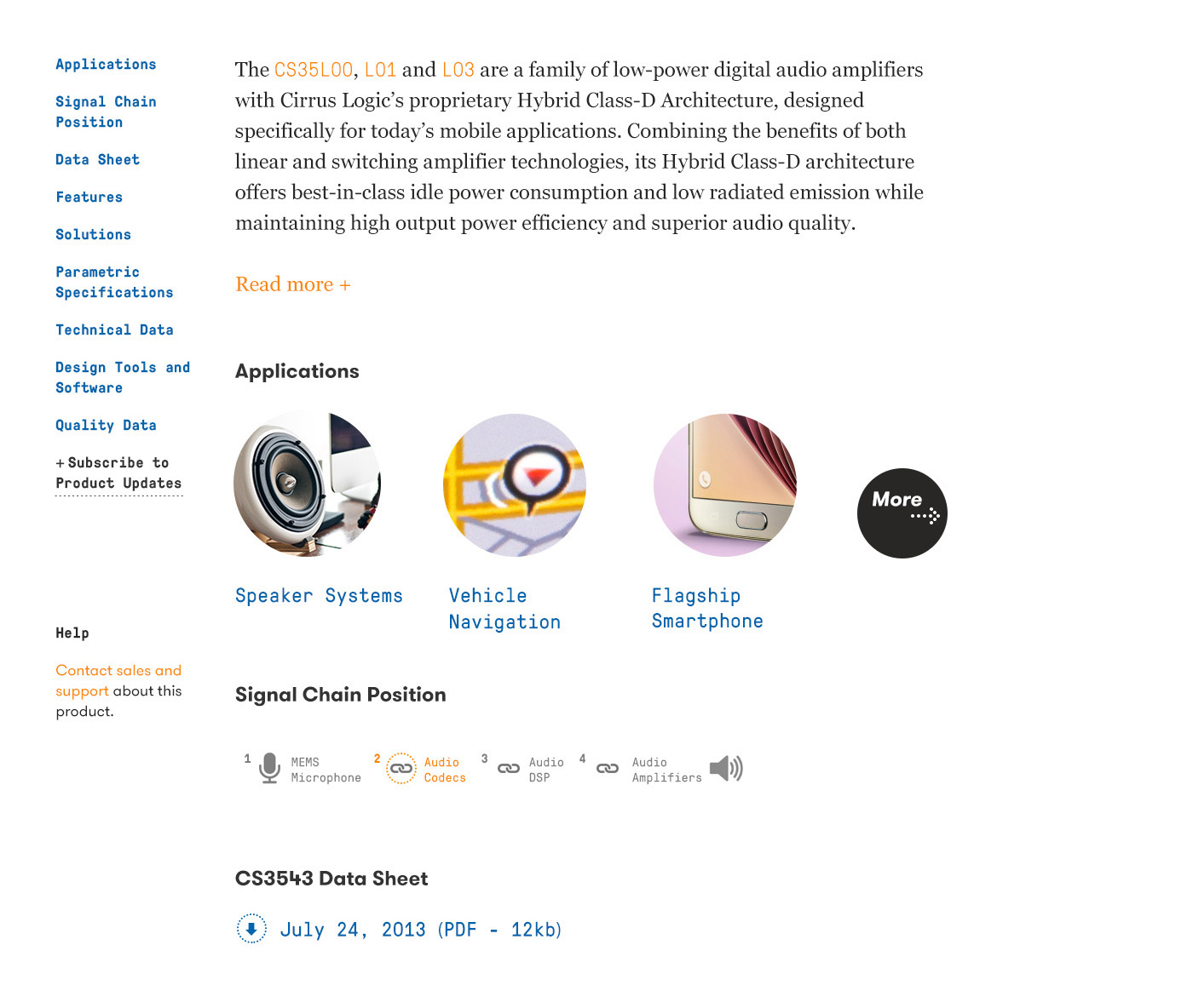
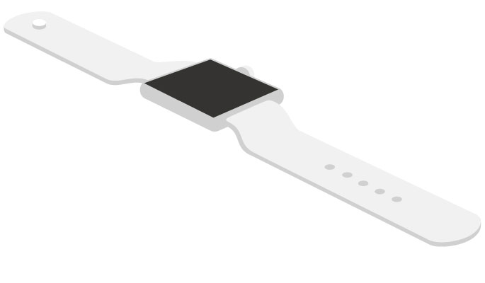
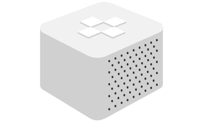
Leaving no stone unturned, the entire brand language was refreshed during this process, including technical illustrations and diagrams.
![]()

The color palette was updated to a kind of candy assortment of pinks, yellows, oranges, and purples to complement and, at the same time, enliven the corporate blue and gray.
Type is GT Walsheim, GT Pressura, and Georgia.
Type is GT Walsheim, GT Pressura, and Georgia.
Information architecture: Amanda Buck, Aura Seltzer. Designer-in-charge: Amanda Buck. Design support and illustration: Dana Pavlichko. Front-end developer: Stephen Caver. Project manager: Andréa Pié.