Harvard College: User first
Site consolidation and redesign.
Strategy, direction, conceptual design.
Made at Happy Cog. Oct 12–Nov 13
The Harvard College redesign was part of Harvard’s big diversity push. Historically they’ve struggled attracting an ethnically diverse student body for two reasons: one, many academically qualified students with financial challenges weren’t applying because they assumed the tuition was too steep; and two, some students without those challenges still thought they’d feel isolated on a campus considered to be mostly wealthy and white. It was a two-prong perception problem, at the root of which was really a question about access to Harvard as both a brand and institution.
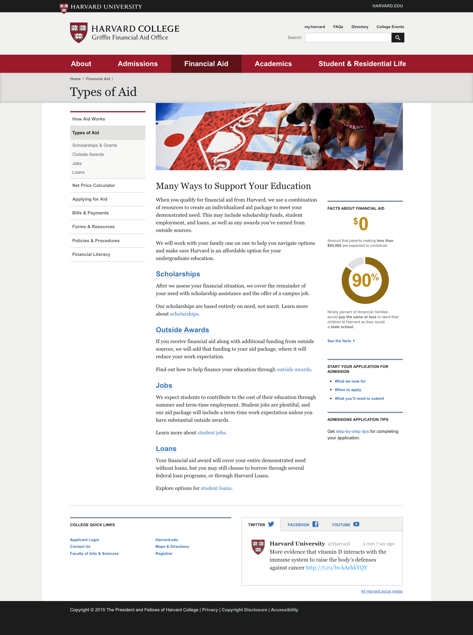
Foregrounding the affordability and inclusivity messages was central to the experience strategy. Compounding the issue, Harvard College’s web presence was fractured into three sites: one each for the college, financial aid, and admissions; each run by three different teams with three different deans. Content duplication and lack of experience parity confused prospective students. Combining them into one had the added benefit of measurably reducing confusion: applications stayed level, while calls into the overworked call center declined.
Designer-in-charge: Aura Seltzer. Content strategist: Sara Wachter-Boettcher. Front-end developer: Brandon Rosage. Project Manager: Allison Fegel.