Rebrand concept for emergency ‘main street’ lender
Brand update, not implemented.
Creative direction, workshop facilitation, concept, copywriting, design. Designed for Vector Media Group with OMF, November 2018.
With few options left to them because of their credit histories high-interest borrowers are ideal marks for shady downmarket banks. That a majority of these loans are predatory probably goes without saying.
Rather than trap desperate lendees in a never-ending cycle of debt dependency, OMF tries to earn repeat customers by taking considerable interest in their financial futures, tailoring realistic plans to individual circumstances and including complementary financial planning and household budgeting among their financial literacy services.
From the outside looking in you’d be hard-pressed to spot that difference, though. All downmarket lenders share the same language, all appear compassionate, kind; all invoke that ‘human touch’ (hand-drawn icons, saccarine stock photos); all traffic in the same folksy signs and symbols (piggybanks); love blue; portray the bank as neoclassical greek temple (you should feel so blessed to get this money!), etc.
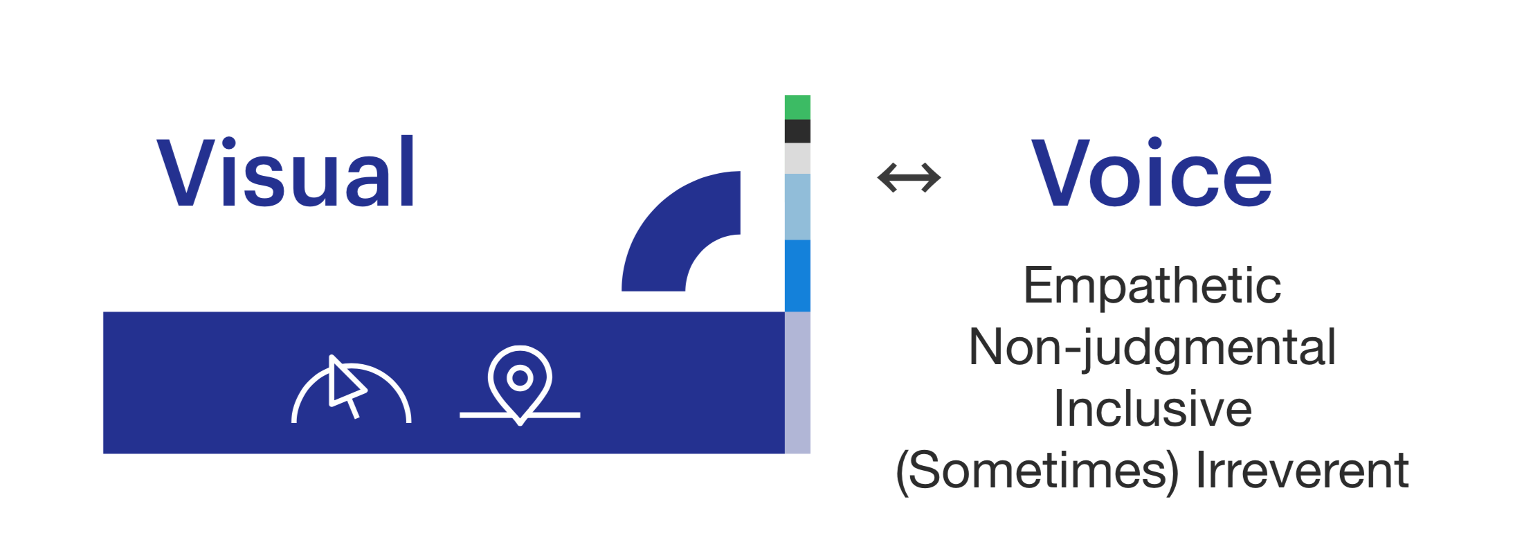
Yet nothing they share is so hideous and invested with rhetorical power as the credit score meter, a dumb, vulgar reduction of consumer history, competency, and trustworthiness introduced in 1989 as the FICO Score. (FICO unironically says it ‘took prejudice out of the equation.’) This simple score, illustrated as a number along a continuum between 300 and 850, is supposed to tell a lender the inverse degree of risk a potential borrower carries.
Being only one of a handful of OMF’s qualifying factors I thought its erasure and subversion was an interesting departure point.
The initial mark we workshopped blended the credit meter into a rainbow, erasing the distinctions between credit bands. The symbol was accompanied by an updated strapline, ‘loans for every stripe and color,’ a reference to OMF’s commitment to openness and inclusivity.
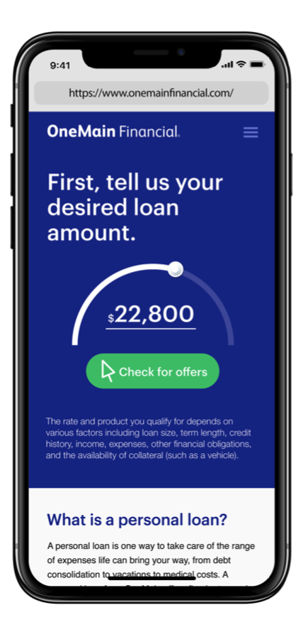
The final iteration, shown below, cuts the meter at its apex, suggesting the gentle flowing arc of the rainbow (particularly in the post-emoji age) even when it’s unvariegated. Fittingly the front half is also where the credit scores of its customers tend to fall.
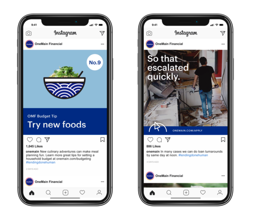
The shape can optionally be used as a container to bring people out of their background context, an allusion to the central conceit that potential customers are people who, regardless of where they fall on the FICO continuum, are irreducible to simple – and frequently accidental – circumstances.
Rather than trap desperate lendees in a never-ending cycle of debt dependency, OMF tries to earn repeat customers by taking considerable interest in their financial futures, tailoring realistic plans to individual circumstances and including complementary financial planning and household budgeting among their financial literacy services.
From the outside looking in you’d be hard-pressed to spot that difference, though. All downmarket lenders share the same language, all appear compassionate, kind; all invoke that ‘human touch’ (hand-drawn icons, saccarine stock photos); all traffic in the same folksy signs and symbols (piggybanks); love blue; portray the bank as neoclassical greek temple (you should feel so blessed to get this money!), etc.
Yet nothing they share is so hideous and invested with rhetorical power as the credit score meter, a dumb, vulgar reduction of consumer history, competency, and trustworthiness introduced in 1989 as the FICO Score. (FICO unironically says it ‘took prejudice out of the equation.’) This simple score, illustrated as a number along a continuum between 300 and 850, is supposed to tell a lender the inverse degree of risk a potential borrower carries.
Being only one of a handful of OMF’s qualifying factors I thought its erasure and subversion was an interesting departure point.
The initial mark we workshopped blended the credit meter into a rainbow, erasing the distinctions between credit bands. The symbol was accompanied by an updated strapline, ‘loans for every stripe and color,’ a reference to OMF’s commitment to openness and inclusivity.
The final iteration, shown below, cuts the meter at its apex, suggesting the gentle flowing arc of the rainbow (particularly in the post-emoji age) even when it’s unvariegated. Fittingly the front half is also where the credit scores of its customers tend to fall.
The shape can optionally be used as a container to bring people out of their background context, an allusion to the central conceit that potential customers are people who, regardless of where they fall on the FICO continuum, are irreducible to simple – and frequently accidental – circumstances.