Philly.com: a Tale of Two Cities
Redesign concept, unused. Art direction, design. Made at Happy Cog, July 2015. Collaborators: Dan Mall, Patrick Marsceill.
Unlike other major cities along the 95 corridor, Philadelphia hasn’t been able to push its Revolutionary War history into the background.
That’s unlikely to change while the municipal logo go-to remains the Liberty Bell (used again for the 2016 DNC, another squandered opportunity to rebrand the city as forward-looking), and so much of the infrastructure budget is centered around improvements along Independence Mall.
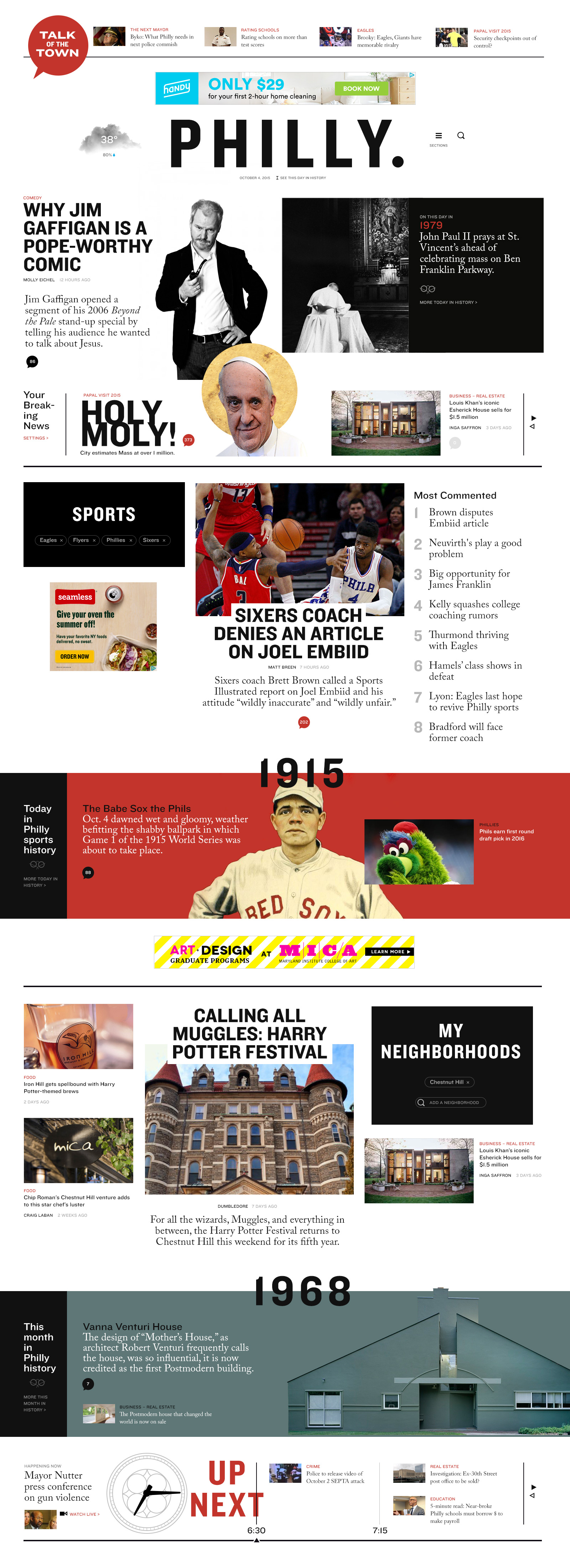
This concept recontextualized Philly.com’s archival content based on the day’s events, rebranding the paper—and to some degree the city it speaks for—as an intellectual, tech-savvy influencer with a proud, blue-collar past.
The site is set in Knockout and Caslon: Knockout as a nod to boxing posters (Philly is, after all, home to Rocky), Caslon because Benjamin Franklin seldom used anything else. The existing Philly.com red-dot logo is repurposed into a comments bubble.
That’s unlikely to change while the municipal logo go-to remains the Liberty Bell (used again for the 2016 DNC, another squandered opportunity to rebrand the city as forward-looking), and so much of the infrastructure budget is centered around improvements along Independence Mall.
This concept recontextualized Philly.com’s archival content based on the day’s events, rebranding the paper—and to some degree the city it speaks for—as an intellectual, tech-savvy influencer with a proud, blue-collar past.
The site is set in Knockout and Caslon: Knockout as a nod to boxing posters (Philly is, after all, home to Rocky), Caslon because Benjamin Franklin seldom used anything else. The existing Philly.com red-dot logo is repurposed into a comments bubble.